Brainstorm
Mood Board

Artist Research
Alexander Khokhlov

|
I used Alexander Khokhlov as part of my artist research in my previous unit which was illusion. However, in this series of portraits, Khokhlov has used colour, shapes and paint to make it look as though the models have been turned into paintings. He has used a lot of colour and different painting techniques to create a range of images that have distorted the models to make the photographs look unique and appealing. This fits with my theme of distortion because I will be using this as inspiration for this sub-theme and using paint to create a real life painting by using a model.
|

|

|

|

|
I like the use of the white background and pale model to make it look almost like a watercolour painting on a blank canvas. The colours also compliment each other well for example the purple and blue work well together and the use of warm colours breaks the cool toned colours. Khokhlov has used paint drips which have been created by diluting the body paint with a lot of water to give the image a 'watercolour' effect which makes the whole image look like a painting rather than a photograph. There is emphasis around facial features defining them with sharper brush strokes. The models hair has been slicked back which also diverts the viewers attention onto the paint itself. The models skin is almost completely white, and this blends her into the background. I really like this effect and will try to recreate this piece of work.
|
|
In this image, Khokhlov has used blocks of colour instead of streaks and has also stuck parts of newspaper and magazine articles onto the model and has painted over them. The use of vibrant colours connotes the idea of fun and uniqueness, whilst keeping cooler tones such as blues and turquoise even though they are also vibrant. The background seems to blend into the model with the abstract block colours and newspapers and the only part of the body that is defined is the face due to it being the brightest colour. There are also highlights painted onto the models lips to make them stand out and the eyebrows have been painted a dark brown so they also stand out among the colour. The eyelids have been painted blue so the warm colours can be broken up. The use of the newspapers and magazines further display the idea of the model being turned into a painting, and her hair is also kept back so it does not interfere with the colourful background which allows the model to blend into the colours.
|

|
Marcello Castellani
|
Marcello Castellani is a Colombian visual artist who starts off by using traditional photography to capture his subject and uses post production in which he adds layers onto an image to create a 'drip watercolour' effect painting by adding digital paint using a variety of software to generate his desired result. The use of various techniques allows Castellani to create unique pieces of art and uses post production on top of photography to distort a model and turn them into something completely different.
|
|

|

|

|
This piece of artwork by Castellani is one of my favourites as he has used more of the models body rather than just the face. The image still looks very realistic but there is still an appropriate amount of distortion which changes the models appearance and makes her look like a painting. The pale blue background is the main source of colour in the image has the other parts of the image are kept as neutral colours due to natural dark brown hair colour and pale skin. The only other colour that stands out in the image is the lips which have been enhanced to look like they are a brighter shade of pink. This is a good way of keeping the image simple as if there were more colours used, there may have been too much going on in the image due to the main focus being on the distorted 'drip painting effect' of the model. The image is kept simple but still unique as the colour from the background is also dripping into the model, as well as her hair and body also dripping. I won't recreate these images exactly but I have gained inspiration from them by creating watercolour drip paintings using a model and post production in photoshop.
|
|
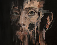
This is another one of my favourite pieces of artwork done by Castellani as it uses a black background, making the image look darker and it also only uses the models face and not her hair, or shoulders. Even though this piece of art has less colour in it than the other piece, I still think there is a lot going on in the image as the main focus is the models face. This part of the image also stands out among the dark background which allows the viewer to appreciate the drip style effect of the models face as the drips are emphasised against the black background due to them being skin coloured. Some of the drips are also pink and grey which are dripping down from the models lips and eyes. These two colours stand out even though they are neutral in the image. The eyebrows also stand out much more than anything else in the image as they are kept quite bold. The deconstruction of photographic images in pixels and spilling paint onto the canvas allows them to look like threads which is an interesting and unique way of portraying challenging the ordinary. The work of Marcello Castellani will partly inspire my own photography in terms of the drip effects in the image which make the model look like a painting.
|

|
Idea sheets
|
|
|
|
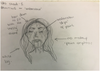
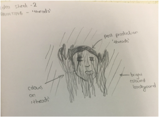
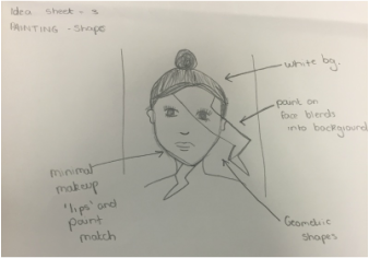
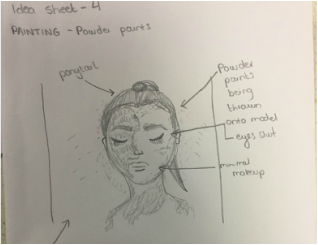
I have a variety of ideas for my painting portrait unit which all add to the exam unit of challenging the ordinary. For example, my first idea is to make the model look as though they are a watercolour painting. I would use a white background to make it look as though the model has been painted onto a blank canvas. I want to use bright colours such as blue, purple and pink for this photoshoot to make the colours stand out against the pale skin and white background. I feel like keeping the models hair down to keep the 'messy' theme of the photoshoot or keeping it pulled back and neat will put the emphasis on the models face. For my second idea, I want to try and recreate the work of Marcello Castellani but a more simple version. For this, I want to use bright coloured backgrounds and use post production to try and make the models face look like 'threads' to distort their face and turn them into a painting. The background will compliment the models skin tone and eyes as I will keep the models looking simple and distort them using post production. My third idea is to paint a geometric shape onto the model and blend that with a part of the background. For example, I will have the paint coming off onto a white background which I will achieve by using photoshop. Finally, I would like to use powder paints as I like the texture that is achieved whilst the paint is being thrown onto the model.
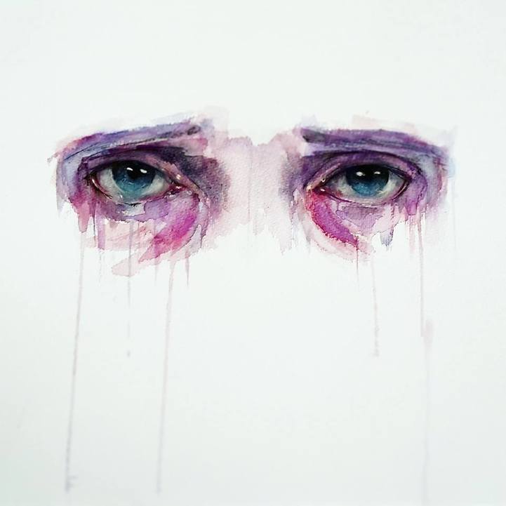
Paintings by Jone Begroa

|
|

|
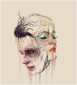
I found these paintings by Jone Begroa online, and decided to steer away from the full face watercolour look and instead focus on the eyes. I feel that using this as inspiration would help me achieve striking final pieces that show the eyes along with a mask of colour around the eyes which would make the images look as though they are challenging the ordinary.

|

|

|

|
These watercolour paintings are what I will use as inspiration for my own photoshoots as I really like these pieces and would like to recreate them with a real life model. I will paint the models face white and put her against a white background to allow me to dodge them to make it look as though the models face blends into the background.
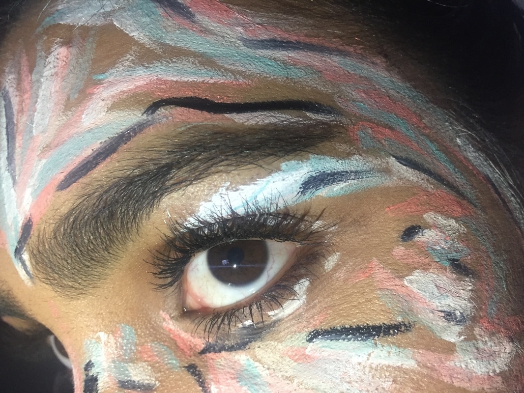
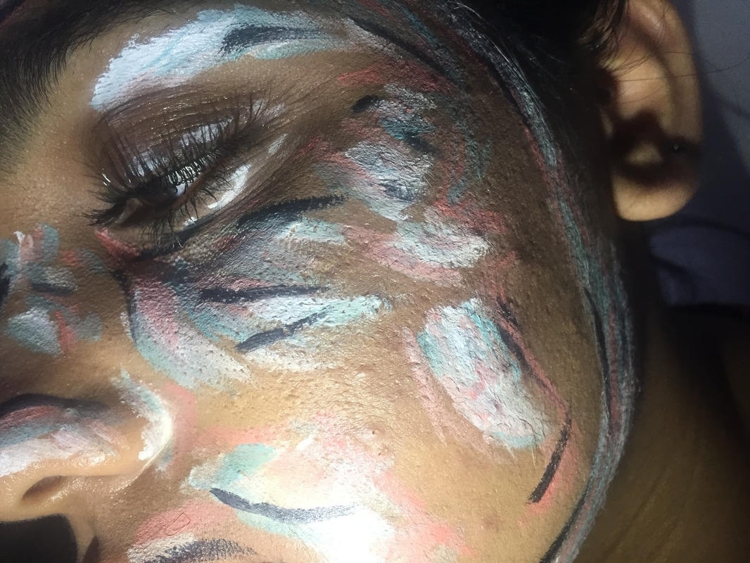
Photoshoot 1 - Experimentation
In this photoshoot, I was experimenting with the paint application to see if I could achieve the abstract/paint streak effect. However, I was not happy with how the paint turned out as I would have preferred if the paint looked more like watercolour drips which is my next photoshoot idea. In the next photoshoot, I will paint the models face white as I feel that doing this will help the paint stand out more. I will also have to dilute the paint with a lot more water to achieve the 'watercolour' effect rather than the paint being more of a block of colour and streaky.
Top 2
|
|
Even though this photoshoot was unsuccessful, these two images are still my favourite due to the composition. In my next photoshoots I would rather photograph the whole face, however as this was experimentation, I was copying an image I had seen on Instagram but the application of the paint looked a lot easier than it actually was due to the precision of the lines on the face. The images had also been taken as close up as this therefore I thought I would try and replicate that in my experimentation. I like how in the first image the models eye is open which contrasts against the light colours painted on the face. This image is also quite clear as the colours stand out a bit more than in the other photos, however in my next photoshoot I will make sure to paint the model white before applying and diluting the paint.
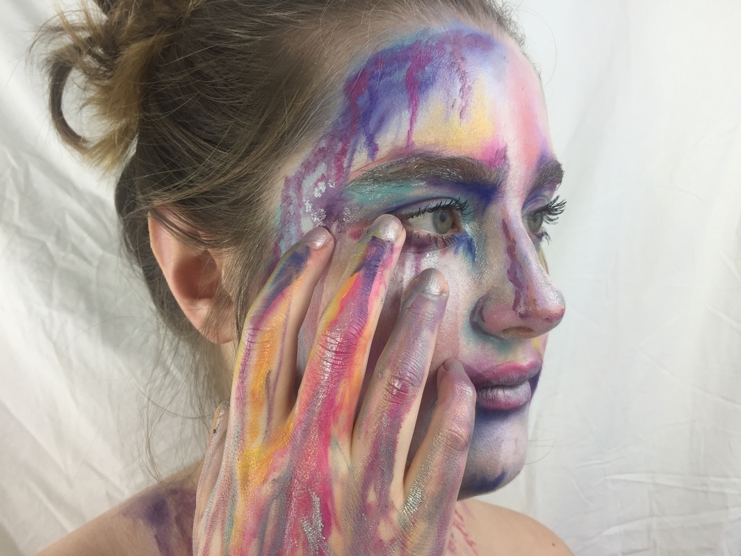
Photoshoot 2
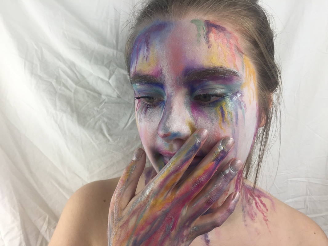
The purpose of this photoshoot was to make my model look as though she is a painting. In my opinion, this photoshoot was very successful as the paint application was a lot better than the first experimentation photoshoot. The colours compliment each other well and I painted the models face white before applying the paint 'drips'. The lighting in this photoshoot was successful as it flattered my model well and enhanced the colours on the face.
Top 2
|
|
These are my favourite two images as I really like the composition of them. I painted the models hand for these two photographs to have more of a range of images to choose from. They look more unique than the first few photos that I took which were just of the model looking up or down so I think by using her hand, it made the images look more effective and 'paint like'. In the first photograph, the close up of the model is effective as you can see the paint drips clearly whereas in the second image, the focus is on the hand over the face which I think is effective as the lighting creates some shadows on her face which gives the photo dimension.
Photoshop experimentation

Firstly, I adjusted the brightness and contrast to make the colours on the models face look more vivid and brighter. This is so the model stands out against the background which is white as well as the base paint.
|

Next I used the dodge tool to smooth out the background as the white sheet had creases and this also helped make it look brighter.
|

Next I used the sponge tool which allowed me to brighten certain parts of the photo, in this case I made the colours brighter so they stand out however I used a lower opacity so the vibrancy was not overbearing.
|

Finally, I used the sharpen tool to sharpen the front parts of the image which were the face as I wanted the rest to be kept out of focus such as the hair which put more emphasis on the face paint.
|
Before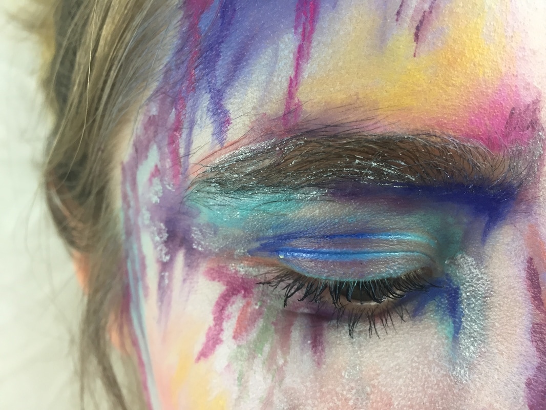
|
After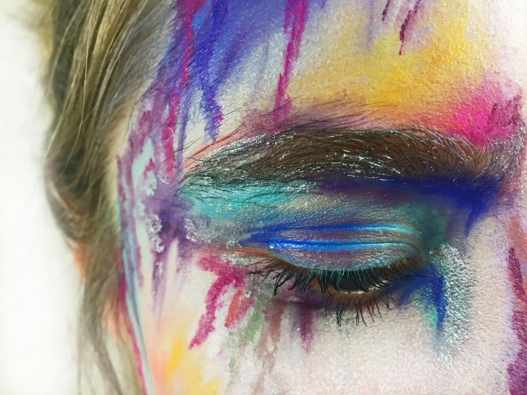
|
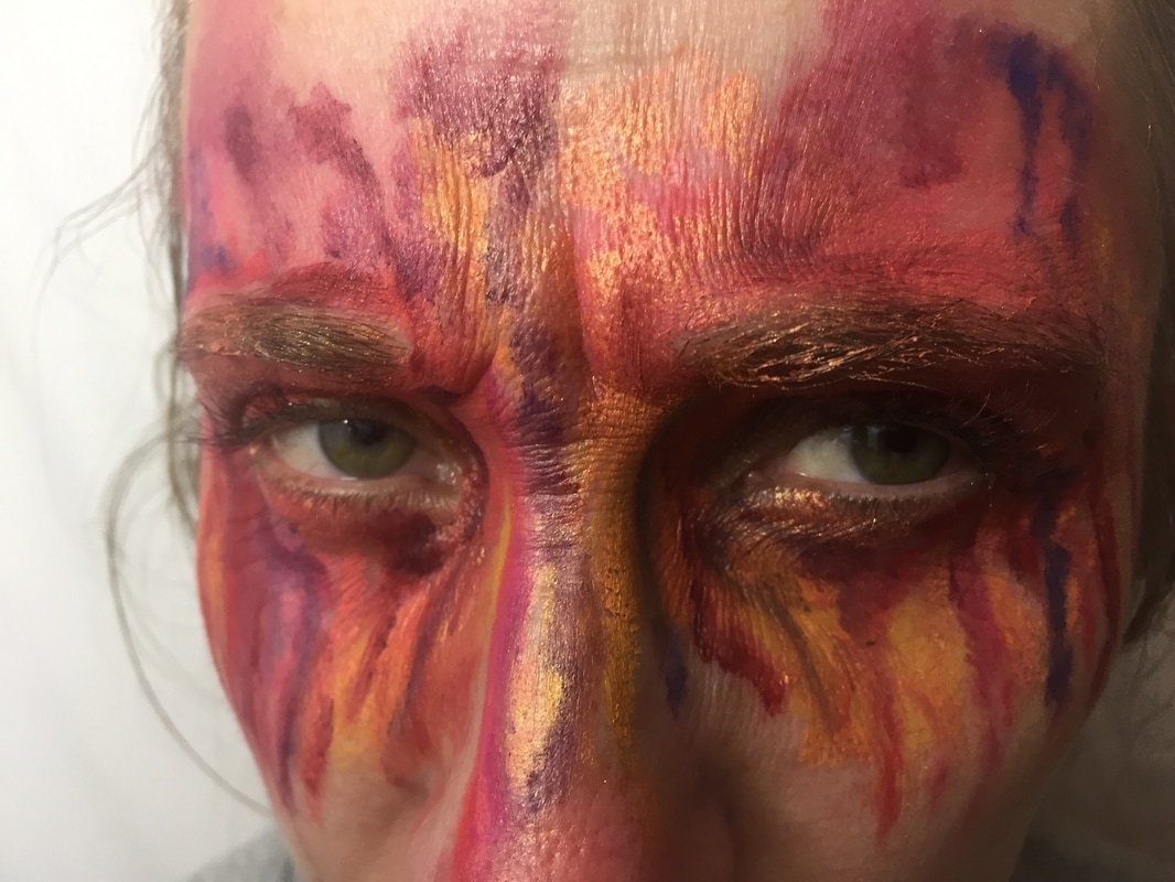
Photoshoot 3
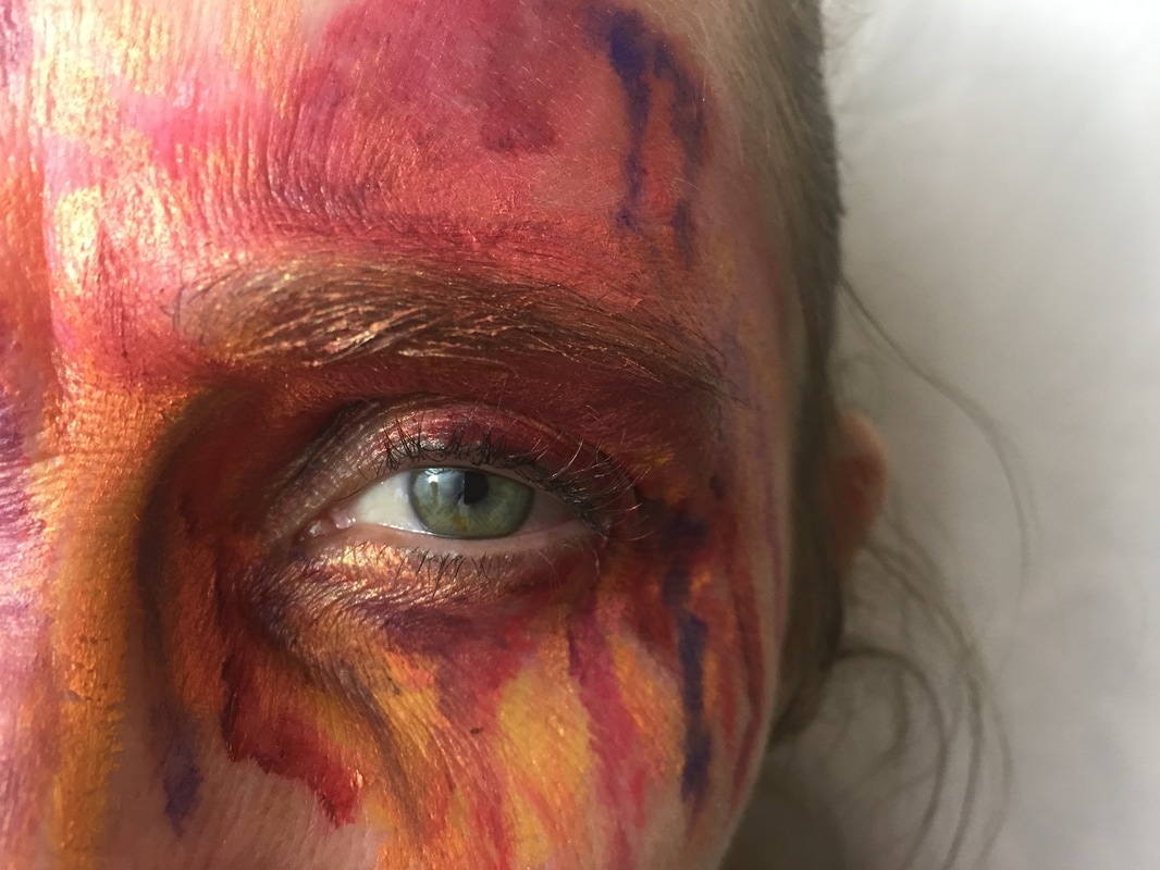
The purpose of this photoshoot was to focus purely on the eyes as I was inspired by the work of Jone Bengoa in terms of colours complimenting emotion. I decided to move on from photographing the whole face as I wanted to focus on eyes and emotion due to there being a lot going on in the images already. In this case, the colours I focused on were warm tones such as red gold and orange but I did also add some dark purple to break up the warmth and add some definition. These are colours that are associated with anger and destruction and therefore I felt that it was appropriate to use them.
Top 2
|
|
I feel that anger is portrayed well within these two images due to how close the camera was to the eyes. I think it is very effective how the model is looking directly at the camera which makes these images appear more striking. In the first image, I like how the eye is in focus and the hair and background are slightly blurred which makes this photo look more three dimensional as it has depth. In the second image, I do like how both of the eyes are shown but I feel that this one is darker compared to the other one in which there is more definition and you can see the highlight in the eye. My next step is to edit this image in photoshop and enhance the colours to make the warm colours look more striking along with the emotion.
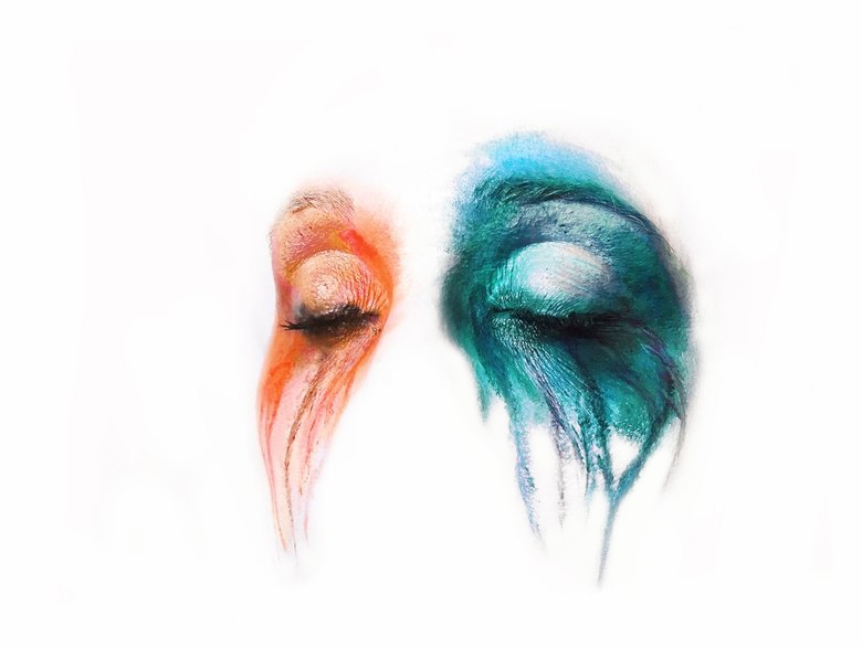
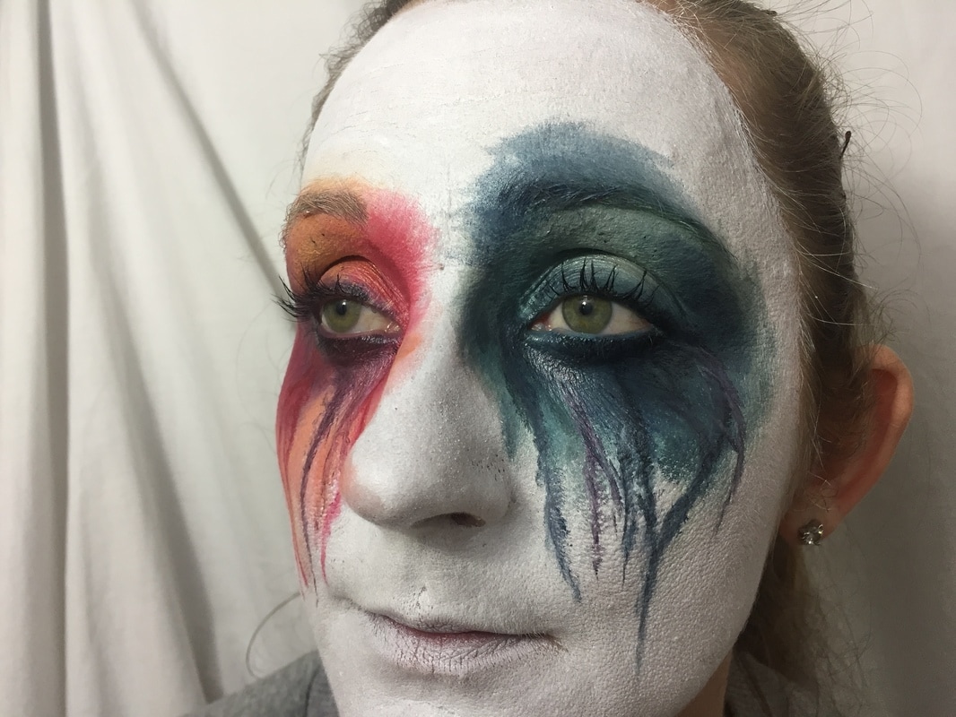
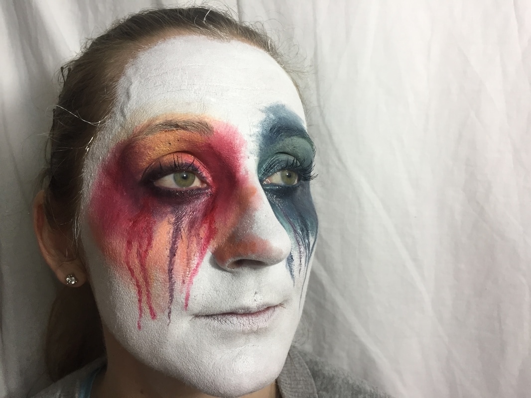
Photoshoot 4
The purpose of this photoshoot was to improve on my last photoshoots which were focused on the eyes. To improve this further, I decided to recreate a watercolour painting and use it as a reference picture for my own paint. I chose a painting that I thought looked effective, in this case the blue and the red are contrasting colours. This helped me achieve a bright watercolour effect as I also painted the models face white to bring out the colour even more and the paints were also shiny on the face which added to the watercolour effect. I painted the models face white, scraped her hair back and used a white background as in photoshop I will dodge the background, hair and face just leaving the paint and the eyes to make it look like the paintings that I was inspired by. Overall, I think this shoot was successful as these photographs will allow me to achieve the watercolour painting effect that I was planning on from the start.
Top 2
|
|
In my opinion, these images are the best from this shoot as they both show the blue and red sides of the face clearly, and they are also both lit well, allowing the shiny texture of the paint to show. These two images will make it easy for me to dodge out the hair, background and parts of the face that I don't want to be seen in my final pieces. I feel that these images are very successful in terms of allowing me to produce final pieces that are aesthetically pleasing. The fact that the model is well lit in these images also enhances her eye colour which makes the images look even more vibrant as they stand out against the paint well. I will also be able to saturate the colours well which will allow them to look vibrant and heavy which is something that I want to achieve as it is essential to apply more makeup in photography than you normally would, to be able to achieve the vibrant effect.
Photoshop tutorial 2

The first step was to add a new layer and enhance the brightness and contrast. I made sure to enhance this more than I normally would as it would overexpose the white on the face which would make it easier to dodge.
|

Next I used the paint tool and made a rough outline to get rid of the hair and background, then changing the opacity and using a smaller brush to make sure that the face blended into the background.
|

Next I needed to dodge out the parts of the face that I did not want to be in the image, therefore I used a high exposure to get rid of the shadows.
|

I then went back in with the paint tool and went over this again to make sure that the nothing but the eyes and paint were in the image. I also went in with the sponge tool to enhance the paint.
|

Next, I added a new layer and enhanced the brightness to make sure that the paint really stood out, making it look like a painting.
|

Finally, I played around with the hue and saturation to change different colours and make this final piece look different from the other one as the colours had changed.
|
Final Pieces