The aim of 'Glow in the dark' is to use neon paints and black light to capture the human body in a different like and make it look as though it is part of another world or galaxy.
Brainstorm
Mood Board

Artist Research
Hid Saib Neto

|
Hid Saib Neto is a Brazilian photographer who uses flecks of vivid neon paint to decorate a person on their face and shoulders to almost make them look as if they are from a different world. He either covers the whole face or just takes photographs of one part of the face for example, the mouth or hands. This style of photography is a style that I want to recreate because my entire theme is distortion/metamorphosis meaning that I will be able to turn a person into something completely different by using neon paints and a black light.
|

|

|

|

|
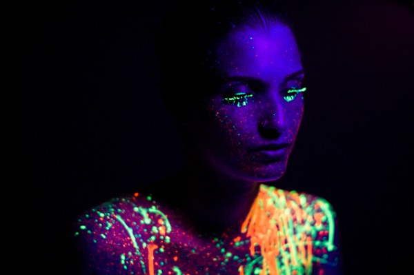
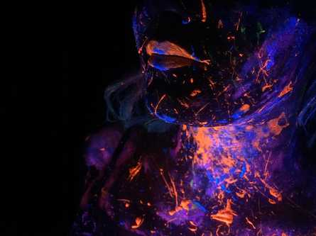
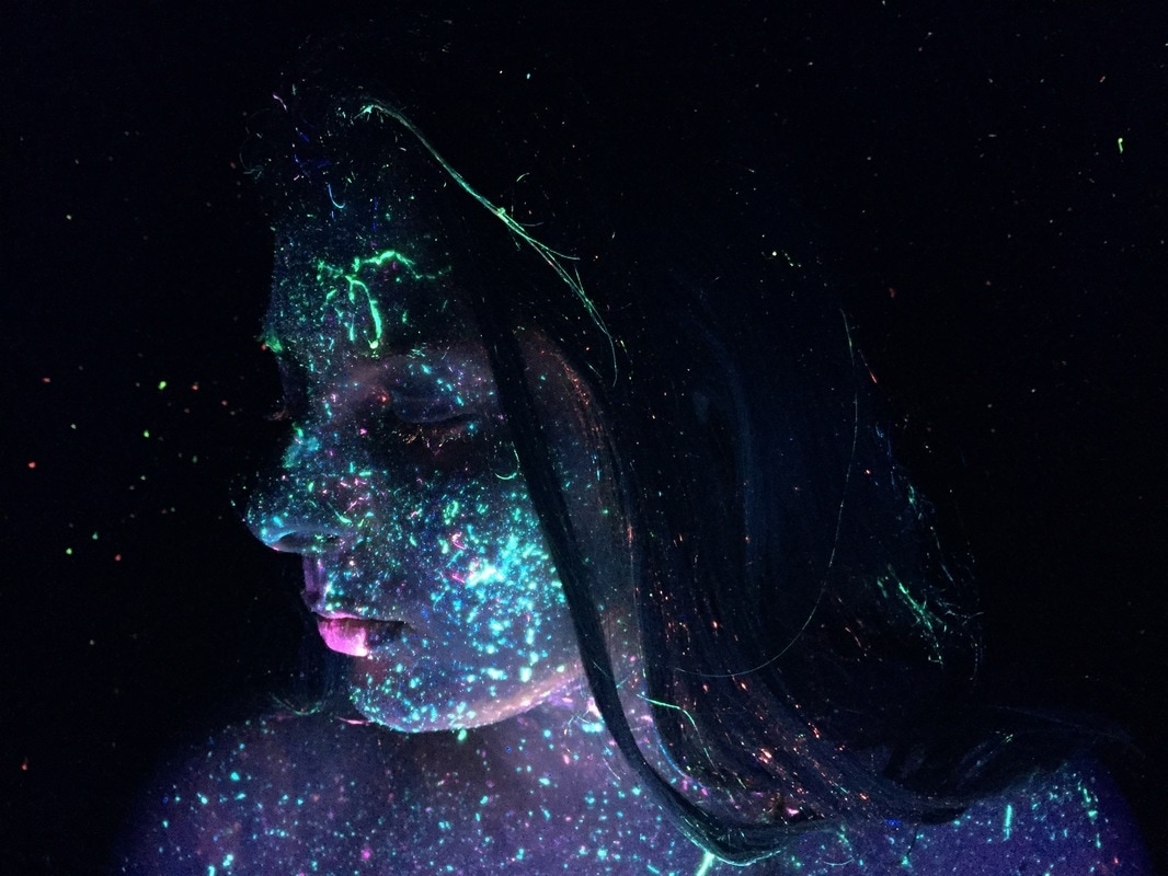
This is one of my favourite images by Hid Saib Neto as he used half a models face to create an astral glow in the dark look. He uses flecks of paint to create something that looks like its from another world. He uses colours that complement each other, in this case he uses blue and pink to give the image a cool but vibrant tone. The colours give off an effect that the model has purple skin which creates a piece that looks like a galaxy on their face. There are only two colours in the image which keeps it simple however there still looks like there's a lot going on in the image due to the style of paint that he uses. I like how the image can be kept simple by only using two colours but it is not plain due to the flecks of paint, making it look more unique and interesting. Neto also uses a black background as black light does not react with black, to direct all the focus of the image onto the model. In some cases, the models face can be blacked out meaning that they'll be submerged into the black background which can create an effect that looks as if though they have no other facial features but the ones that the neon paint covers. This is a good way of distorting an image as you are turning somebody into a glow painting rather than keeping them looking like a person.
|
|
This photograph by Hid Saib Neto is another one of my favourites as he has used green and orange which are another two colours that complement each other. Again, he has used half of a models face to create something that looks robotic/futuristic. This image is more vibrant than the other one due to the colours that Neto has used. He has also painted green makeup onto the model which we can see on the eyelashes and eyelids as though she would do it everyday, giving the image an element of normality however the fact that it is all neon makes it look distorted and unique and adds another dimension. In this image Neto has painted orange onto the models lips rather than using his particular fleck style of paint. The eyes and lips are painted normally which brings the viewers attention to them rather than the rest of the face even though his usual style of orange flecks are still painted onto the model. The fact that the lips and eyes are painted normally makes the model look more humanistic however she is still distorted due to not being able to see any other part of her body but the paint covered parts. Once again, he has used a black background so the black light doesn't react and the attention is diverted towards the paint rather than the rest of the face.
|

|
Sarah Leal

|
Sarah Leal is a Brazilian photographer that uses glow in the dark paint and black light to put emphasis on parts of the body that are normally masked by sunlight. She captures the human body in a completely different light that we are used to in everyday light. Leal was inspired by Hid Saib Neto, however instead of only using flecks of paint she more often uses smears too, to create a different effect. She also takes photos of different parts of the body as well as just the face such as hands.
|
|
|

|

|
This image by Sarah Leal is one of my favourites due to the fact that this is a photograph of someones hands instead of an image of a face. This differentiates Sarah Leal from the other artist Neto has her images involve more streaks of paint rather than flecks and also the image of the hands gives a different and distorted effect. Leal also uses more colours in all her images as well as keeping the colour scheme the same. For example, in this image she uses green, orange yellow and a hint of blue, All of her images use the same colour scheme which is a running theme throughout her work even though she switches between taking photos of two models faces and just hands. This image of hands is made extremely emotive which makes the image different to what it would've looked like under normal light and without neon paint. The effect that can be unearthed using only black light, neon glow paint, and two subjects or hands is extremely effective compared to what it would look like with normal lighting as it almost gives an opposite effect to everyday life, creating another dimension.
|
|
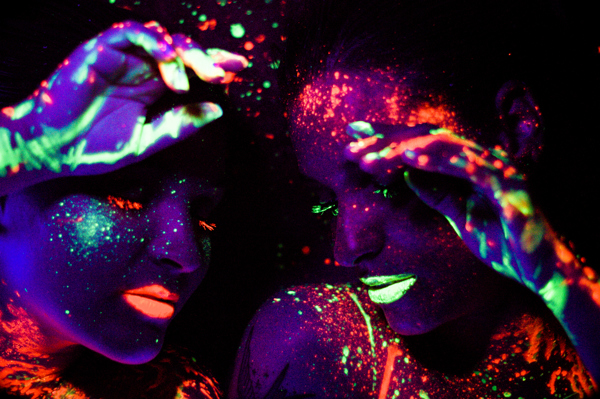
This photograph by Leal is another one of my favourites as she has used two subjects which are similar in terms of paint style but are almost opposites to each other even though the same colours have been used. The two models in the image have the same flecks and streaks of paint but the colours are painted onto different parts of their faces. The neon green and orange paint compliment each other and are used in a smart way due to one model having orange painted onto her lips and eyelashes and the other model having green painted onto her lips and eyelashes. This seems to be the main focus on each of the models however they each have the opposite colour flicked onto their faces and shoulders. The fact that the models are very close in the image and one has her hand on the other face gives us a visual sense of opposites attracting and rubbing off onto each other in day to day life and becoming close friends. Leal has also used a black background to divert all of the attention onto the models and let us as an audience focus mainly on their lips and eyelashes and a bit on their shoulders, hands and parts of the face which may not be as noticeable in day to day life, creating an almost alternate universe effect.
|

|
Idea Sheets

|

|

|

|
One of my ideas for this unit was to use a clear acrylic screen and get my model to stand behind it in front of a black background, and she would smear paint over the screen for example, based off my idea sheet the model would run their hands down the screen and leave hand prints. The only other part of the body that you would be able to see woyld be the lips that would be painted in a similar way as the streaks after the models hands smear paint onto the acrylic. My second idea sheet just shows the model with paint splatters all over them which would just be a recreation of Hid Saib Neto's work. I would also like to only show parts of the face due to the whole unit only showing certain body parts to make it look more distorted and abstract. For example in some images I could just show the lower half of the face and shoulders. My third idea was to take a photo of the whole top half of the models body but only paint certain parts of the face for example, the lips, eyes and hands so the rest of the body would not be shown or would be very faint compared to the vibrant colours. Finally, my last idea was to just show certain body parts such as the hands. All of these ideas show normal everyday things in a different light which is the purpose of this whole unit.
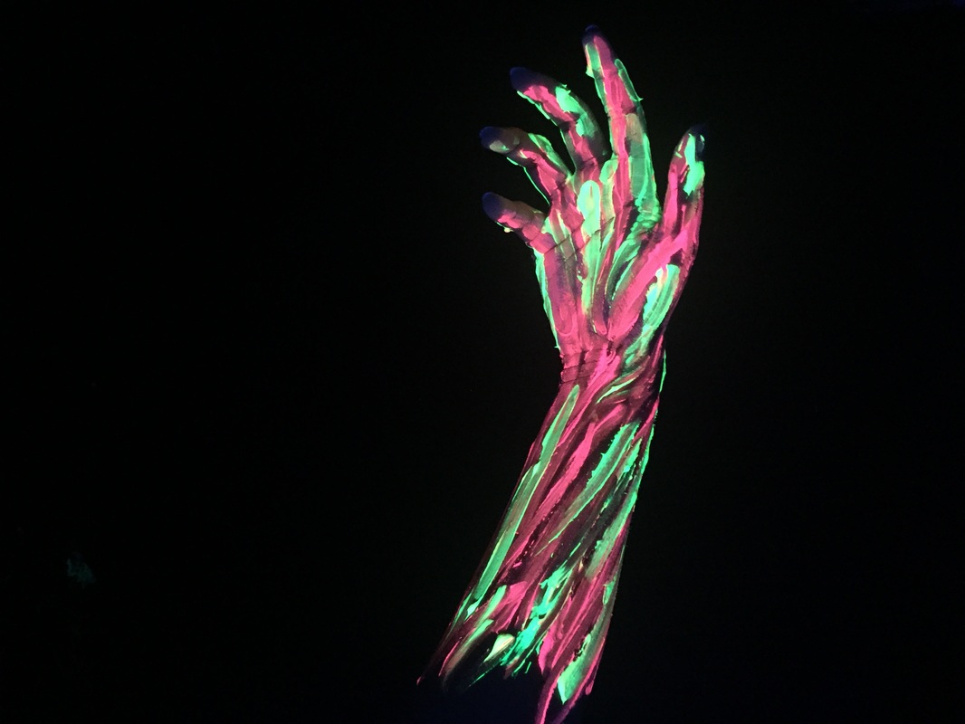
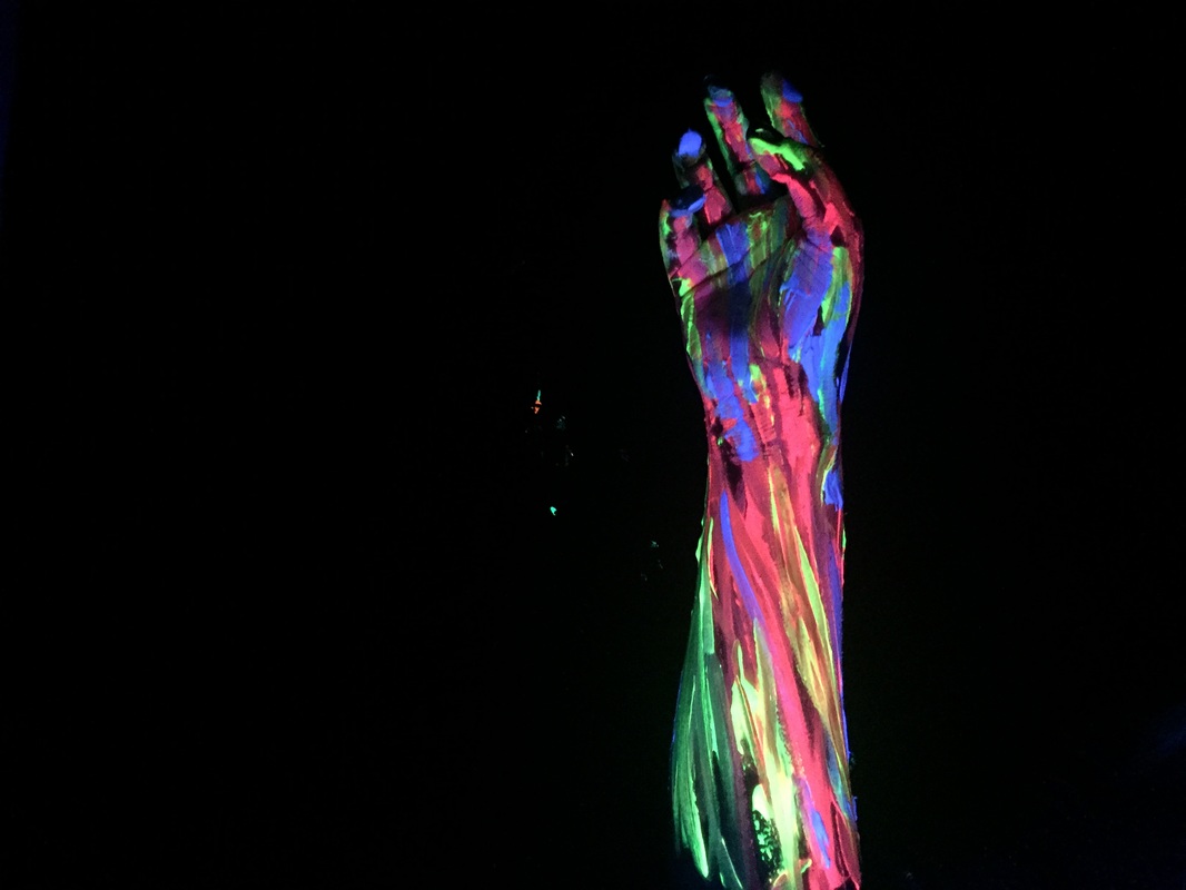
Photoshoot 1 - Hands
The purpose of this photo shoot was to distort a body part in this case hands to show everyday things in a different perspective. I used a blacklight and glow in the dark paint to recreate artists work, and create something abstract. I think this photoshoot was successful because I managed to get the room dark enough and take photos against a black background which would contrast against the bright UV paints. The only problems with this photoshoot that I had was that it was hard to focus the camera at some points, and once the UV paint started drying it would glow less, so the colours were not as vibrant although they were still picked up by the blacklight. However, I could repaint the models hand with more paint which was wet so would end up glowing more so this wasn't too much of a problem. Also, colours such as pink, yellow, orange and green were more vibrant than the blues. Overall, I think this photo shoot was successful and it has helped me build ideas for my next photoshoot which will focus more on colour schemes rather than trying to use a lot of complementary colours.
Top 2
|
|
These two images were my favourite because of how vibrant the UV paints showed up in this image. In the first image I used complementary colours, pink and yellow which contrasted against each other. These were the base colours used in the second image and I added blue and green onto the hand too, as I wanted to experiment with colours and see if more or less looked better. Overall, I think two complementary colours look better in these images so there isn't too much going on but there is still a nice contrast. Even though there were more colours in the second image I still like how the end result turned out. These images were successful as I achieved the effect that I wanted which was an abstract glow in the dark piece of work which would distort something normal and show it in a different light.
Photoshop experimentation

To edit these images in photoshop, I started by duplicating the layer to make sure that if I made any mistakes I could start over without closing the whole image and I could also see the difference and enhancements between the original and edited image.
|

Next, I changed the brightness and contrast of the image. I found that the lower the brightness, and higher the more vibrant the colours against the black background whereas a higher brightness setting made the image look too overexposed and the colours almost lost their glow and vibrancy.
|

Next, I played around with the curves of the image as it would allow me to enhance certain parts of the image which meant that I could make sure that tones of the image looked good. It also allowed me to add some more contrast, brighten and darken.
|
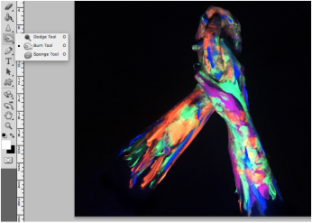
Next, I used the burn tool to burn out aby colour the might have accidentally gotten onto the black background that we were using. It also allowed me to burn out the models arms that were reflecting slightly due to the black light. This made the final outcome look more abstract and distorted as you could not see the models actual arms but just the paint.
|
Before |
After |

|

|
The purpose of photoshopping this image was to enhance the colours of the UV paint, to make it stand out more against the black background, due to the paint not being strong enough to glow as muvh as it could have due to the fact that it was drying. This allowed me to achieve the effect that I wanted which was a bright glow in the dark unit.
Mini final outcomes
|
|
These were my mini outcomes as I liked a lot of images in the first photoshoot, so I edited all of the best ones using the same photoshop process that I used in the experimentation. I feel like some of these would be good enough to use as a final piece, so my next step is to do photoshoots which include my other ideas so I can build a portfolio of final pieces for this unit.
|
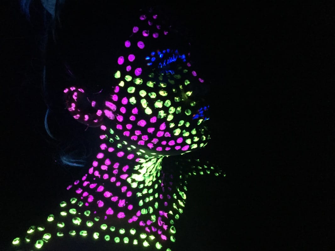
Photoshoot 2
This photoshoot was successful in terms of the colours that I used and how vibrant the UV paint turned out under the black light. However, the application of the paint was quite bulky as I wanted to use polka dots but the end of the brush kept picking up too much product which didn't give me the desired effect that I wanted which was more delicate. It also seemed to make my model look like a floating head and quite 2D rather than there being a prominent facial structure which is accentuated by the glow in the dark paint.
Top 2
|
|
These two images were my favourite because I added more polka dots to the shoulders so my model didn't look as though she had no body. She also had bleached hair which reflected under the blacklight, which was an accident however it ended up adding to the uniqueness of the images. I also think as the paint application was so bulky and made my model look almost 2D, this is why I these two images were my favourite as the model was looking to the side which ended up giving her more of a defined facial structure. When I try these photoshoots again I will most likely recreate a similar style to the artists that I have researched as I feel that delicate paint application will be more effective.
Photoshoot 3
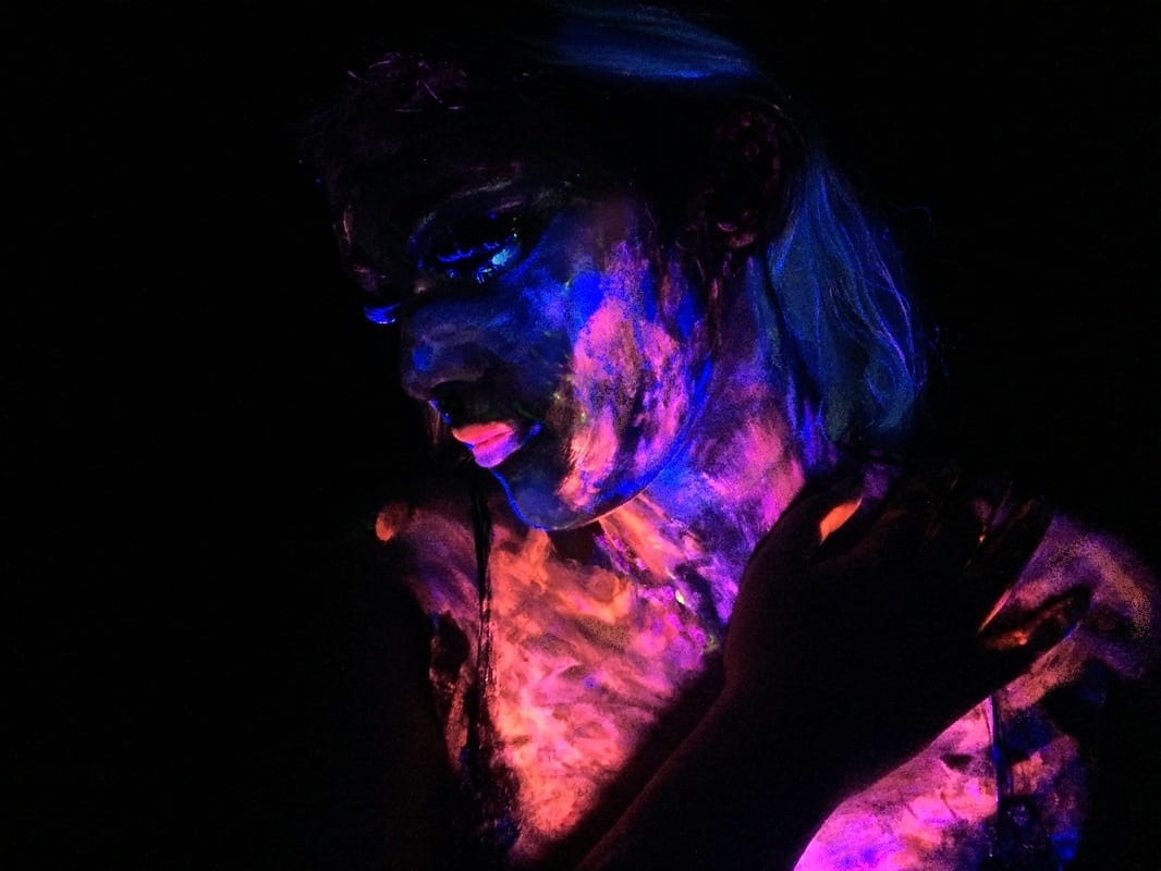
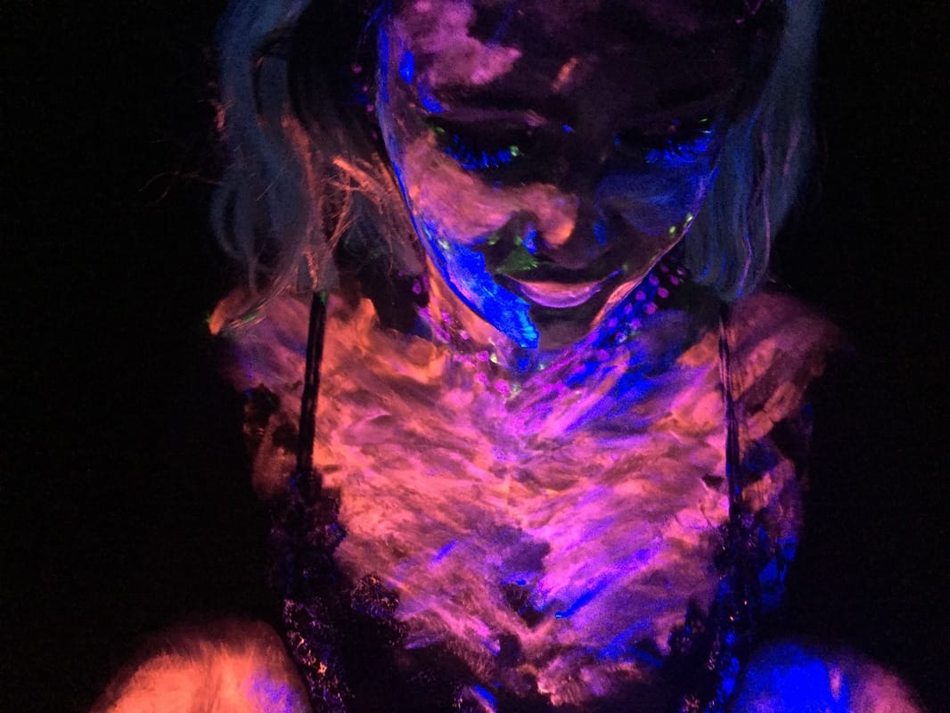
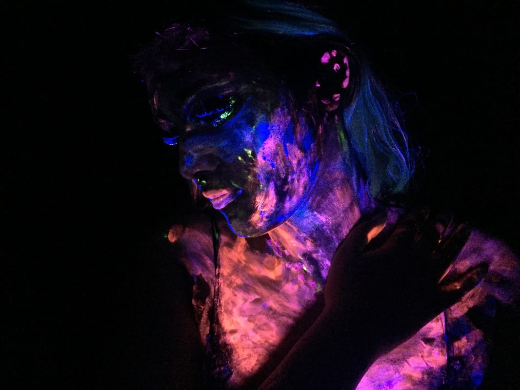
During this photoshoot, I had the idea of the model smearing her hands across her body whilst they were covered in paint so there was no real method in the application of paint and it was quite random. This meant that I did not know how the images would turn out and I could experiment and see if there was an idea that I could build on from this photoshoot. The images that I took later on were better than the first few because the model had the chance to smear her hands all over her face and chest more which distributed more of the paint across her chest. We ended up accidentally creating a look which made the model look as though her chest was glowing and look a little like her ribs too. This was an effect that I was not intending to get however I liked where this random paint application got me as I did not think to make it look as though the model had glowing ribs which wad quite effective. However, even though I preferred this photoshoot to the last one, I still think that delicate paint application would have been better.
Top 2
|
|
These two were my favourite images as these were taken later on in the shoot once the model had smeared more paint all over her chest. I like the contrasting colours which were pink and blue and the cool and warm toned colours broke up the block colours.In the second image I like how the model has her hand across her chest and you can see the shadow from her arm block out the colour which gives the photo more dimension. I also like how in the first image one of the models hands is pink/orange with some blue in it and the other hand is blue with some pink in it and then both of the colours are mixed onto the chest which looks like ribs or a glowing chest.
Photoshoot 4
This photoshoot was a little more successful than the first one because I tried to get the desired effect of the paint splatters which would make the image look spacey and intergalactic. However, I used the wrong tool to apply the paint flicks as the paint brush was too flimsy and wouldn't flick the paint off onto the models face in a delicate way and instead turned out too bulky. This made it look more like paint splatters rather than stars or a galaxy. It also didn't help that I had no one to hold the blacklight for me and the model had to end up holding it herself whilst I took photos which meant that she couldn't see where she was holding the blacklight so in many of the images the paint didn't glow as much as I would have liked it too. I liked the splatter effect the most so next time I do these photoshoots I will improve them by using something with firmer bristles such as a toothbrush so the application of the paint is more delicate.
Top 2
|
|
These two were my favourite images as they were probably the most successful out of the photoshoot, especially the second one. In the second image, the blacklight was closer to the model which made the paint look brighter than it does in the first image and many of the others. I like the contrast of the cool and warm colours in these two photos and you can still see the definition of the face. In the first image I quite like how the chin and bottom half of the face is in focus and brighter whereas the shoulders and chest are darker due to the blacklight being directly under the chin. However, the only problem in these images is that I applied a block colour of paint onto the lips which draws the attention of the viewer away from the flecks of paint which is the desired effect and more towards the lips so next time i'll keep the lips unpainted and flick paint onto them in the same way that the rest of the body is covered so they don't take the attention away from the paint application.
Mini outcomes
|
|
I edited my favourite images from the photoshoots that I did so I could get used to editing glow in the dark images and can build from these images and create better photographs with a different style of paint application. In the next photoshoots that I do I will be trying to build final pieces and so will have to focus on the paint application, colours and where the blacklight will be in terms of lighting up the face properly so the paint looks like it glows a lot more. I also hope to improve my paint application so it looks less bulky which will be a massive improvement from these photoshoots.
|
Photoshoot 5
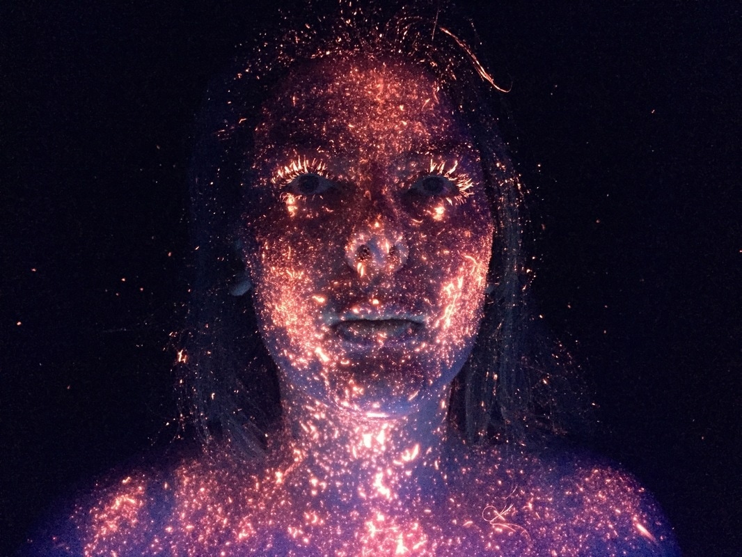
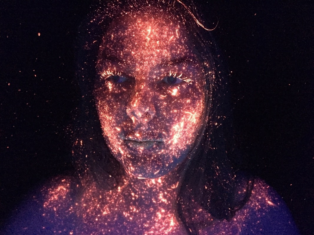
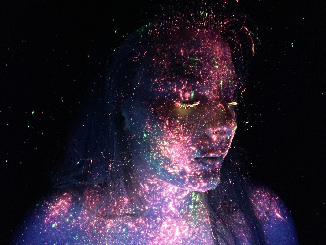
My first photoshoot that I will be picking a final piece from was very successful as I gained the splatter effect that I wanted and the paint application was more delicate. The paint looks a lot more galactic and the models face is still very defined and there is still dimension in the photograph. I also like how I added the paint in the hair and background to add to the galactic effect that I was trying to achieve. I decided to just use one warm colour in this photoshoot and add colour into the next one as I wanted to see the difference between having just one colour and then contrasting warm colours. Overall, I think this photoshoot was a success and there are images in this shoot that I will use as a final piece.
Top 2
|
|
These two images are my favourite as I like the composition of them. For example, in the first image the model is looking up which gives the sense of empowerment and as the image is supposed to portray a galaxy or universe I like the connotations of this. Also, the models facial features are still very defined even though she has a lot of paint on her. The second image is a little brighter and closer up and I like how you can clearly see that the eyelashes are covered in orange paint. I also like how the paint is evident in the models hair in these two images as it doesn't make her look like a floating head and in the second image, the models hair is slightly over her left shoulder but it still does not interfere with the paint on her body due to there being flicks of paint in the hair.
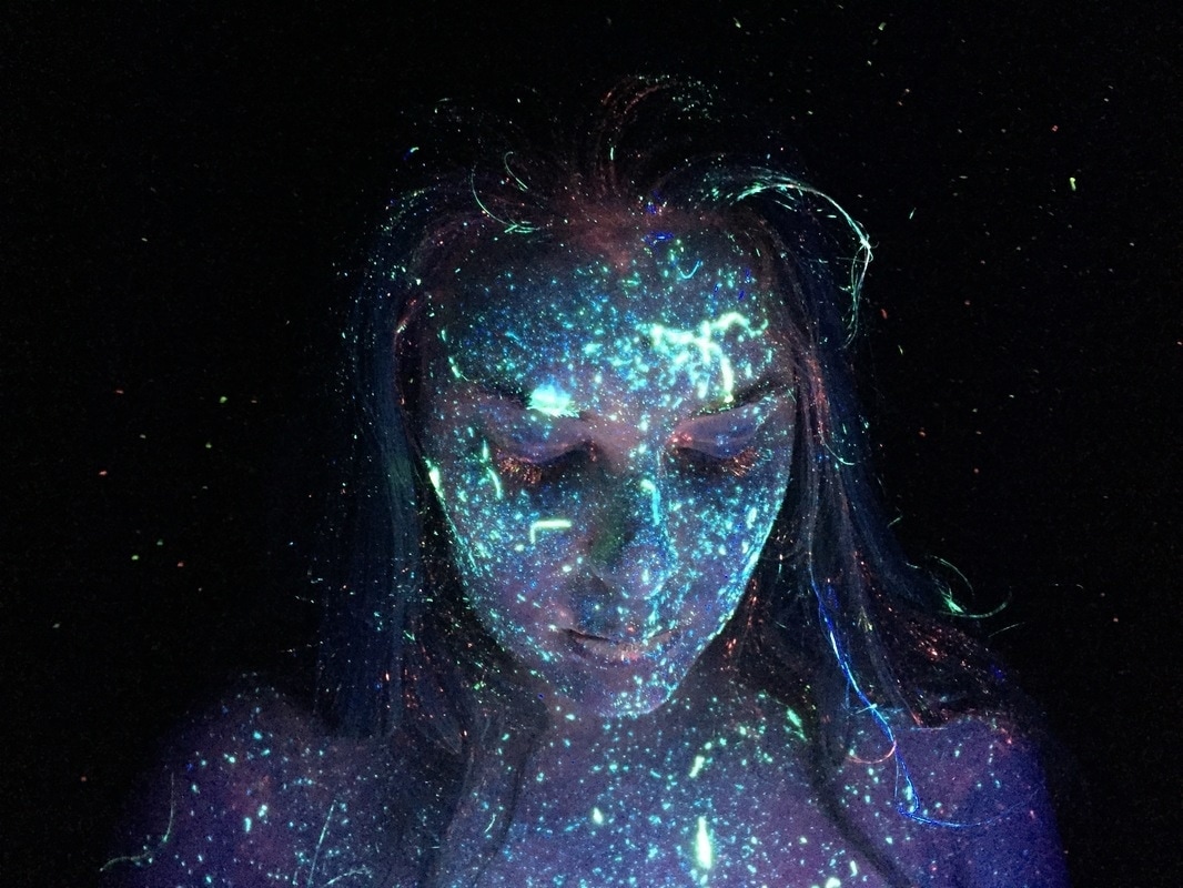
Photoshoot 6
This photoshoot was also successful and I decided to keep with the same theme and application of the paint as it was such a success last time and I wanted all of my final pieces to look as though they are part of the same portfolio, but there are some minor differences. For example, in this photoshoot I decided to add yellow into it as it is lighter than the orange and ended up making the orange look more red. You can clearly see the contrast between the colours even though they are both warm tones. I also made sure to control where the blacklight was and kept it in the same place which made the glow paint look brighter which was very effective in achieving the desired images. In my next shoot, I will use cooler tones so there will be contrasting colours within my final pieces.
Top 2
|
|
These two images are my favourites as the paint looks more red than orange like in the first photoshoot. I also really like the composition in these images as the models face looks defined with the delicate flecks of paint on her. In the second image, sue to the model looking to the side you can see the outline of her nose and her lashes are also defined with the yellow paint. The fact that her shoulders have been kept straight defines her jawline. However, if I was to use the second image as a final piece I would have to edit in more paint on the side of the face as the model faced forward during the paint application so it was difficult to see where there was less paint. I like the way the colours showed up in the first image as they are still very bright but the image is not over exposed. I also like how you can still see her facial features which makes this image one of my favourites.
Photoshoot 7
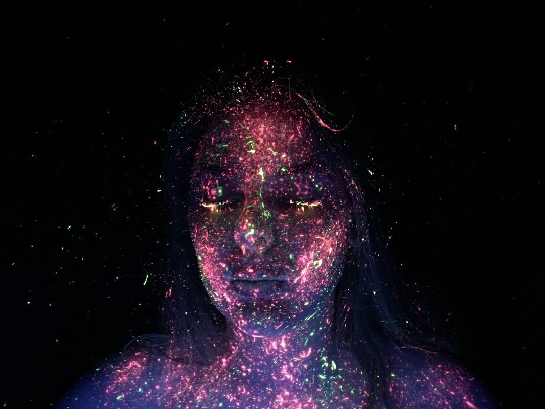
This photoshoot was not as successful as the other two in terms of colour due to the cooler tones not being as prominent under the black light and they almost look as though they don't glow as much as the other colours. However, this is not much of a problem as I can enhance the images in photoshop, making the colour appear brighter than it actually is by adjusting the hue and saturation. I still like the outcome of this photoshoot as I kept the paint application the same as in the other shoots so it still looks effective and starry. Too much paint accidentally flicked off the toothbrush onto the models forehead but I quite like the effect it gave as the final images looked more like a galaxy. I also like the small amounts of orange that were left from the previous photoshoots as it breaks up the cool tones. In photoshop I will need to enhance the colours and I also feel that some parts of the body were not covered in as much paint as I would have liked them to be so I will make the paint flicks look more dense whilst editing the images.
Top 2
|
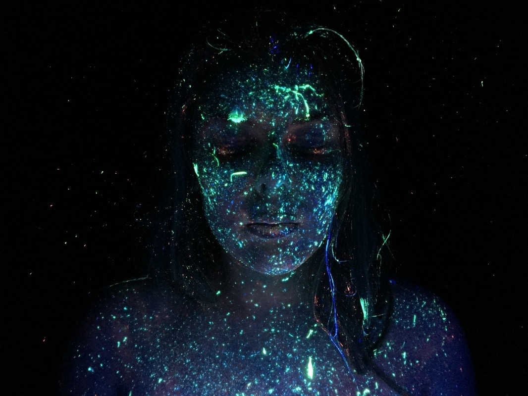
|
These two images are my top two because I think that as this photoshoot was not as successful as the first two, these two photographs managed to capture the colours well compared to some other shots. I also like the composition of these photos which is similar to my top two in my first photoshoot. Due to that photoshoot being so successful, I knew that the model looking down with the blacklight closer to her would benefit me as the cool tones would look brighter and the models face would be defined. Overall, I think these two images were the most successful considering the fact that I struggled with the cooler toned colours. I will be able to enhance these images in photoshop and make the colours in the image look brighter as I could not achieve the brightness that I wanted to like in the first two photoshoots where I used warmer colours. I think that these images will be good for a final piece once I have edited them to enhance the colour and fill in any gaps that might have less paint.
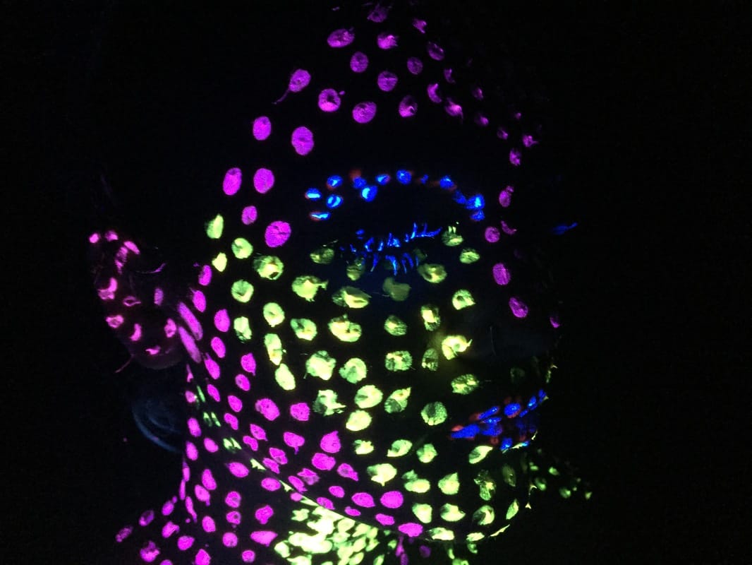
Photoshoot 8
My final photoshoot was also successful as I kept the green paint on from the photoshoot before and added pink paint onto the face. I wanted there to be a contrast between the two colours so I picked a warm toned shade as I wanted to experiment with the images. However, as the green paint was drying it became less bright so it looks as though the model doesn't have that much paint on her compared to the first two photoshoots. I also experimented in this shoot and took quite a few images of the model moving to see how the images would turned out as I knew that the paint would leave a sort of light trail and capture the movement well. However, as I did not take as many movement images in the previous photoshoots I decided not to use these as a final piece as I wanted to keep all the images the same. I also feel as though the paint was captured better whilst the model was still, however I just wanted to experiment with movement in the images.
Top 2
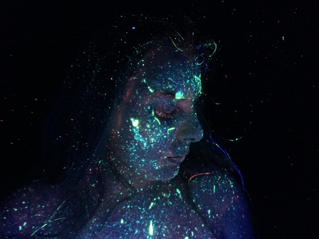
|
|
In this photoshoot, I had a similar problem to the fast one in terms of the colour not being as prominent as I would have liked it to be. However, in this photoshoot I added the pink halfway through and so some of the images are different in terms of colour. My favourite two images were the ones where the model was looking to the side as I feel that in this photoshoot, the most effective images were the ones where the model was looking to the side which defined her facial features. Also, the blacklight was held closer to the models face in these two images and so the paint looked brighter than in some of the other images. When I put these images through photoshop I will be able to brighten the colours so the final outcome will look a lot like I imagined it to look. I also like that in these two images the area around the model is quite dark which contrasts against the bright colour on the face.
Final Pieces